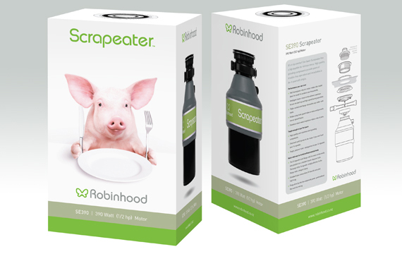
Taking the Scrapeater to market
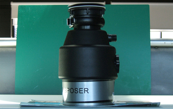
The Scrapeater waste disposer is the most successful new product in Robinhood's recent history.
ProCreation was responsible for the brand name itself, the product branding, packaging, supporting collateral, and launch into the retail channel.
Our starting point was a prototype product and a brief to create a brand with a name that explained itself, (to compete against Insinkerator) was modern and had a sense of eco-friendliness.
With a limited budget for promotion, it was important to have imagery and presentation distinctive enough to stand on its own without advertising support.
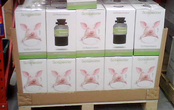
Three months out from the launch of the Scrapeater, Robinhood's market share in the category had increased by 26%. The product is now stocked by hardware chains and plumbing merchants throughout Australasia. Its sales continue to grow.
It's generally acknowledged that the Scrapeater name, identity, branding and packaging played a pivotal role in its success. |