In case you were wondering, I'm a symbol of fertility, growth, abundance, pollination ...you know, birds and bees stuff.
At the moment I'm just decoration, trapped here on the navigation bar,
but one day I'll be linked to my own realm The Anti-Hive and you'll be able to visit me there. That's where I become my evil alter-ego: Marketing Buzzword Bee. >:(
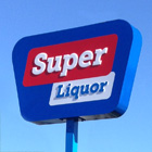
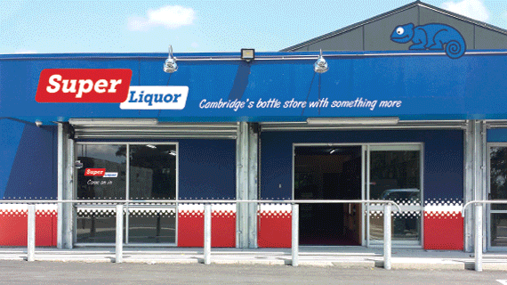
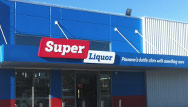
Super Liquor changing identities
With dark blue stores covered in a profusion of logos created in the 1980s, Super Liquor's general retail appearance hadn't so much been "designed" as "occurred by accident".
By 2013, when ProCreation was appointed, it was high time the identity joined the new millennium.
The basic building blocks are a swept-up logo to help distinguish the brand by emphasising the "Super" part of the name; more inviting colours and the invention of an icon that adds personality to the graphics. The work goes a lot further than that though.
There's in-store navigation signage, point of sale material, swept up ticketing and even a new take on how the mandatory HPA regulation posters are written and presented.
The new look is being rolled out across New Zealand through 2014-15.