logo
ABOUT US EXAMPLES OF OUR WORK  

Hello, I'm ProCreation's bee icon. :)

In case you were wondering, I'm a symbol of fertility, growth, abundance, pollination ...you know, birds and bees stuff.

At the moment I'm just decoration, trapped here on the navigation bar,
but one day I'll be linked to my own realm The Anti-Hive and you'll be able to visit me there. That's where I become my evil alter-ego: Marketing Buzzword Bee. >:(

Bee animation


The stores are the tip of the iceberg

Just doing the visual aspects involved in rebranding a national retailer is an extensive undertaking.

Numerous components have to be redesigned; details determined and documented; then there's the process of gaining the acceptance of the many stakeholders.

Much of this work is not really visible to the public but is just as important as the parts that are.

On the right are a handful of items from among the many components of the Super Liquor rebrand, some are deeper below-the-line than others. (The calendar opens as a pdf of the actual thing, so it's a biggish file.)


How-to guides and new look collateral

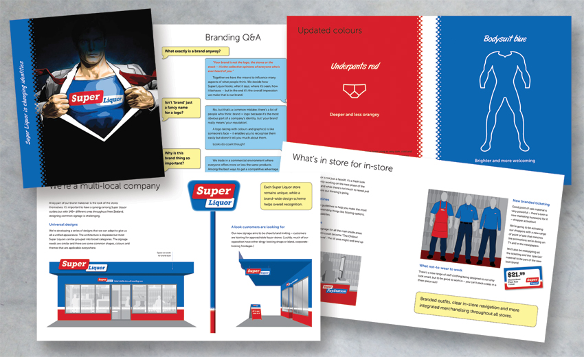
Franchisee information booklet
Within a group like Super Liquor, gaining franchisee support is crucial. This booklet spells out rebranding's benefits in terms individual store owners can understand.

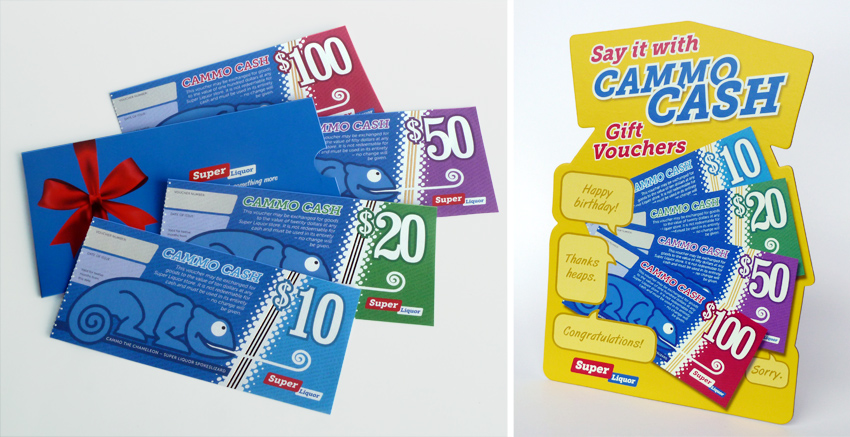
Swept-up gift vouchers
One of the less-obvious manifestations,
gift vouchers are promotional as well as a brand piece. These were developed with their own mini-campaign for in-store use.

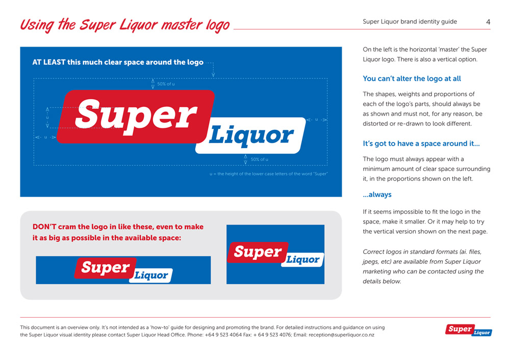
Simple visual identity guide
With many disparate parties involved in any rebrand, a set of rules around the main bits and pieces is essential. This guide features the basics of the new identity.

Store calendar
Brands are more about behaviour and attitude than looks. Super Liquor's calendar is an insight to the brand's innate eccentricity. (Recycling the pictures from the press ads helped produce it economically!)